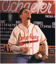
I am not at all certain the world needs another blog, but here I am. As this is my first official entry, I thought it would be appropriate to touch on my views of baseball uniform graphics, as it has so much to do with who I am and why I started a company that does something as weird as make reproductions of obscure baseball jerseys. First, allow me to get something straight: I am not a misty-eyed nostalgist who believes everything was better in simpler times when players played "for the love of the game" (there was no such time), the Dodgers were in Brooklyn, and all was right with the world. If we are serious people we must acknowledge that these "simpler times" also consisted of open racism, as well as the near-indentured servitude of professional baseball players, among other sins. I believe the "the old days" are best appreciated in the full context of the times.
Having said that, I do believe some things in our little world of baseball were indeed better. Older ballparks were generally more intimate and well, human, in scale than even the fanciest of their modern cousins. The game was vastly better appreciated (and contemplated, as baseball is a contemplative game) without the deafening roar of rock music videos, digitized boat races, and other distractions that are almost apologies for the fact that the main event is merely a baseball game; and the nine-man game is infinitely better than the abomination that takes place an almost all leagues but the National. Lastly, baseball uniform graphics were better.
Why is someone charmed when they see an old Alfa Romeo Spider, or a 1960 Cadillac, while a Honda Civic - although a fine reliable automobile - fails to elicit that response? Why does a well-designed pre-war brick building look pleasing while a 1970s glass and steel tower look harsh and cold? The answer? There is a perceived timelessness and aesthetic charm to the Alfa and to that beautiful building. The designer was reaching for something beyond the style or fad of the moment.
Baseball uniforms are no different. At a time when professional sports teams hire expensive marketing firms to create logos and choose team colors, the elegant, simple, graphics and emblems of the past look better and better.
There are a few factors at work here. For one, no one draws anymore. If you think of the best of baseball uniform designs, say the Dodgers script that is still in use, the Yankee classic "NY", the wishbone "C" of the Reds hats, these were all drawn by human beings. Uniforms and logos designed on computer software look like they are designed on computer software. Second, the design firms who do most of the work these days tend to repeat the same type of design over and over again, a factor that is exaggerated by owners wanting what other team already have (sort of like with a lot of the new faux nostalgic ballparks, but that subject is for a future blog). Third, designing logos by committee is like doing anything by committee. Groupthink predominates, good ideas are watered down, and risks are not taken. The result is a plethora of mostly similar, bland, and utterly disposable graphics.
I will use just one example, and as a Mets fan I feel it is fair to mention my team. When the Mets started out, they adopted the colors of the recently-departed Dodgers (blue) and Giants (orange), and threw in pinstripes from the Yankees for good measure. The Mets cursive script at home was fresh but still traditional and the adopted 1930s Giants-style fancy-block "NEW YORK" on the road jersey was perfection. This was design at its best. Several years ago, perhaps feeling insecure, it was decided to add black to the team colors. Putting aside the fact that royal blue and black make for a nauseating combination, this design change all at once seemed forced ("hey, the kids will think we're hip!"), as well as an attempt to have it both ways ("we're traditional and hip!"). This approach has satisfied nobody. The traditional Met fans hate the black, and the hipsters are not fooled.
Ironically, the most recognizable (and I would say valuable, from a merchandise standpoint) emblem in baseball is of course the uniquely odd curved interlocking "NY" of the Yankees. If any designer at a firm proposed this logo today, it would never be accepted, at least without the addition of at least two more colors and probably not even then. It is too simple, to plain, to serendipitous to survive the design process. It is timeless, and it would be hard to put a value on that trademark. But it simply could not be created in today's sports design environment.
So, my appeal to baseball teams as well as graphic artists: Respect tradition, less is more, it's ok to be a little subtle, and for God's sake learn to draw.
Tuesday, May 5, 2009
Subscribe to:
Posts (Atom)
